Box Art VIII: Unearthly Delights
Yes, I'm going to the well twice in one month about this box art thing. And yes, this is the eighth installment. Next month we'll spend our time on something else, but April felt like a good month for more weird box art. In previous
Yes, I’m going to the well twice in one month about this box art thing. And yes, this is the eighth installment. Next month we’ll spend our time on something else, but April felt like a good month for more weird box art. In previous articles, I’ve mentioned how prolific this type of thing is – how deep is the ocean – and I promise I’m not exaggerating. I have five more for you today, and I will continue periodically defaulting to box art articles from time to time.
Without more of my bla-bla-bla, let’s have a look.
MANDRAGORE
Infogrames, 1986
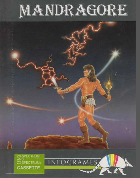
Finally, Burning Man got interesting. This guy is so hopped-up on GHB and star magic that he’s stripped down to his loincloth and decided to fight the pesky lightning-spirits infesting the communal mud pit. Keep the boots, he thought to himself, they look good. The rainbow armadillo represents not only Infogrames, but this man’s lesser self, the shell he hides within, his weakness, leaving him. His id is crushed into annihilation as he becomes a superego-driven archon of love and light. “Fuck your bad vibes, man!” He carries the torch as a symbol of hope in a dark world, the sword as a necessary evil. All of the festival’s other earthly delights fade from his mind. It is just him, the lightning balls, and his sick LARP outfit.
As he is carried out of the swell of nude bodies and pot smoke on an EMS stretcher, his brain receding from the chemical-induced fever dream, his brain thrusts him back into the causal realm. This moment can never be recaptured, and he will long for it until his eventual death from an overdose of designer shit they only tested on dogs. He will rejoin the aether and God will tell him he’s just a big dingus.
CHUCKIE EGG II
A&F Software, 1985
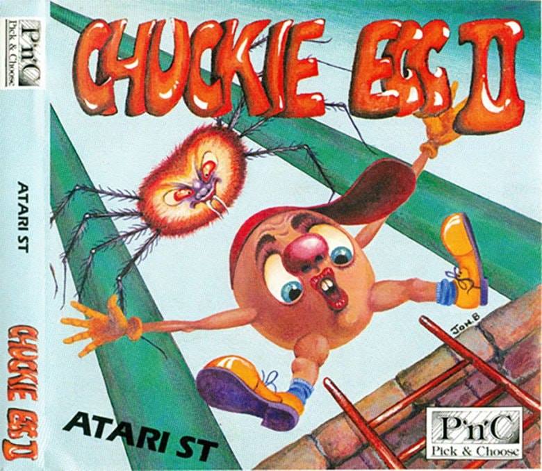
Here we find another hell-world, and its prisoner is poor Chuckie. Not only was he born ugly as hell, he also has to survive in a non-Euclidean landscape where horribly human-faced spiders are never far behind him. Look at that thing’s face. Someone drew that just to be mean to your hind-brain. “Jon B” didn’t even want to put his whole name on this shit. He knew the weight of this and hurried to crawl out from under it.
How does Chuck’s hat stay on his head? Like, just examine that one aspect for a second. If your head had that kind of… slope to it, you’d need to wear a strap to keep a hat on. But wait, my dude doesn’t even have a chin.
Chuckie drew a bad number in the queue of Samsara. He must have been one ill bastard in a previous incarnation. Plus that ladder is going to do a number on his balls (or whatever weird genitals he has that we can’t see) in about half a second. Poor son of a bitch.
CAULDRON II: THE PUMPKIN STRIKES BACK
Palace/RamJam, 1986
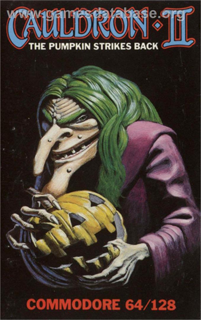
Man, the Joker has really let himself go. He’s let his hair grow all willy-nilly, just a thick barely-tamed mane of green atop his head. Keeping up with makeup isn’t something he worries about now. That was for Batman. Their working relationship has soured, so he focuses on what’s important now: bathrobes, pumpkins, and his “realistic” modeling career. He does not focus on hygiene. At all. You can smell him from five feet away – that gym-sock smell, blended with the stench of earwax and sweat.
Jesting aside, this is pretty well-done box art. They kept it simple and highlighted one significant aspect of the game being sold. I’d compare this to the medium-high quality paintings you’d see on the cover of late-era AD&D book covers. Coming from me, that’s a compliment.
Still though, that face sits in front of a diseased brain considering some really twisted shit. Like how to put bat wings on cobras or which music goes best with juicing a man alive in a laundry press.
AGONY
Art & Magic, 1992
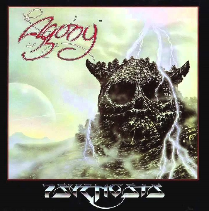
This looks like the kind of game no one in their right mind would fuck with. I’m definitely not ever in my right mind, so I did have a look at the actual game. It’s actually gorgeously done and typical of Amiga’s high graphical standards. This cover art, though… this belongs on an 80s speed metal album. The object portrayed is clearly a structure and not just decoration. The implied scope and size are awesomely terrifying; this obvious den of pure evil even has fucking trees on top of it.
I’ll mention D&D shit again: this is definitely where the Big Bad Evil Guy lives, and by stepping inside you pretty much sign your own death warrant. You will not die peacefully or quickly within the jaws of this fortress. I love this kind of shit. Bring this type of dark art back, instead of the edgelord crap we see all the time today. 80S style fantasy is the best, hands down.
Don’t bother waiting for the storm to stop, either. There’s always lightning. They have a guy just for that. They keep him busy.
WAYOUT
Sirius Software, 1982
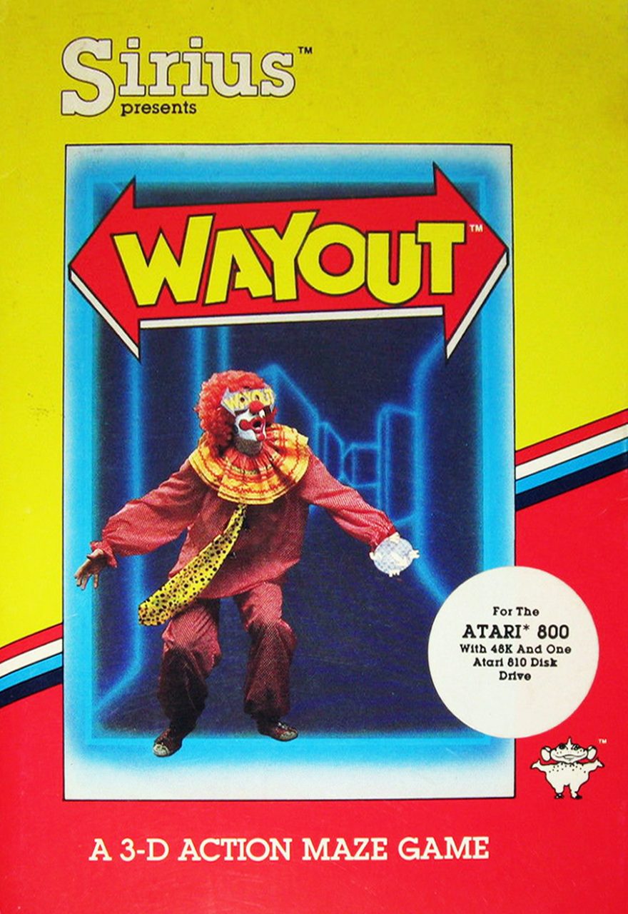
More clowns. Well, just one this time, and he’s paying for his vile sins in the Laser Labyrinth. All his years spent spreading terror and dismay among children come home to roost, as he basks in the stark horror of his predicament. He begins to panic – a new emotion for him – as he realizes that there may well be no “wayout” for him. This is the Pit. This is the place he sent childrens’ dreams, where he stockpiled their fear. The Laser Labyrinth holds something far more terrifying than a minotaur. It holds this clown’s own worst nightmares, and they’re coming.
Laugh now, fucker.


